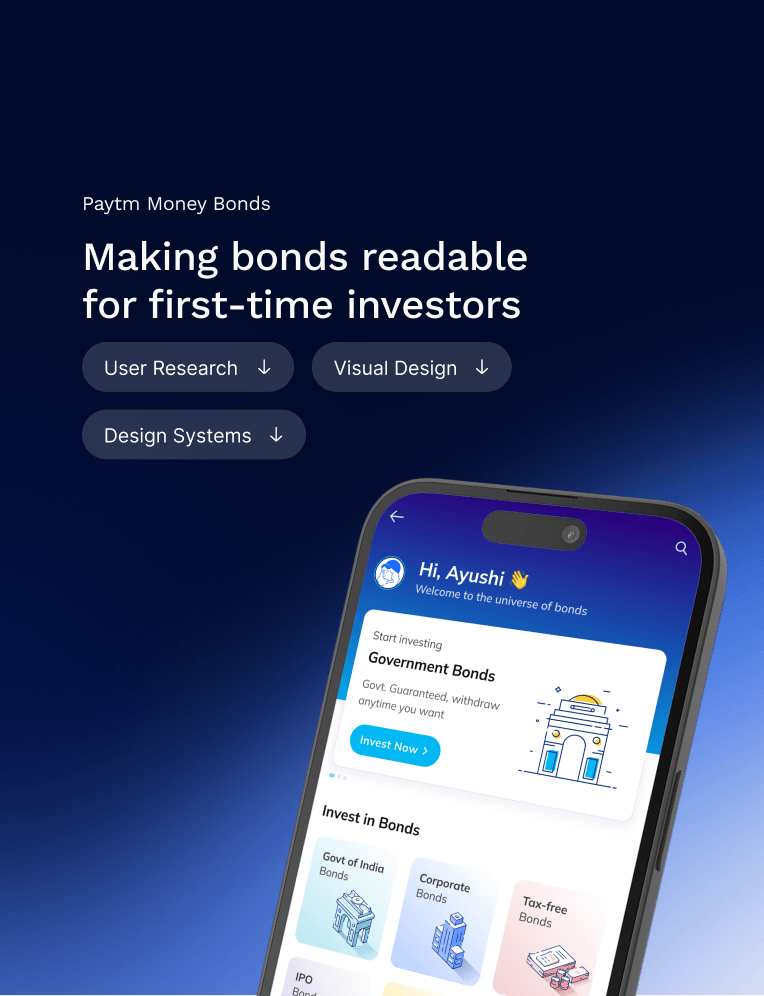
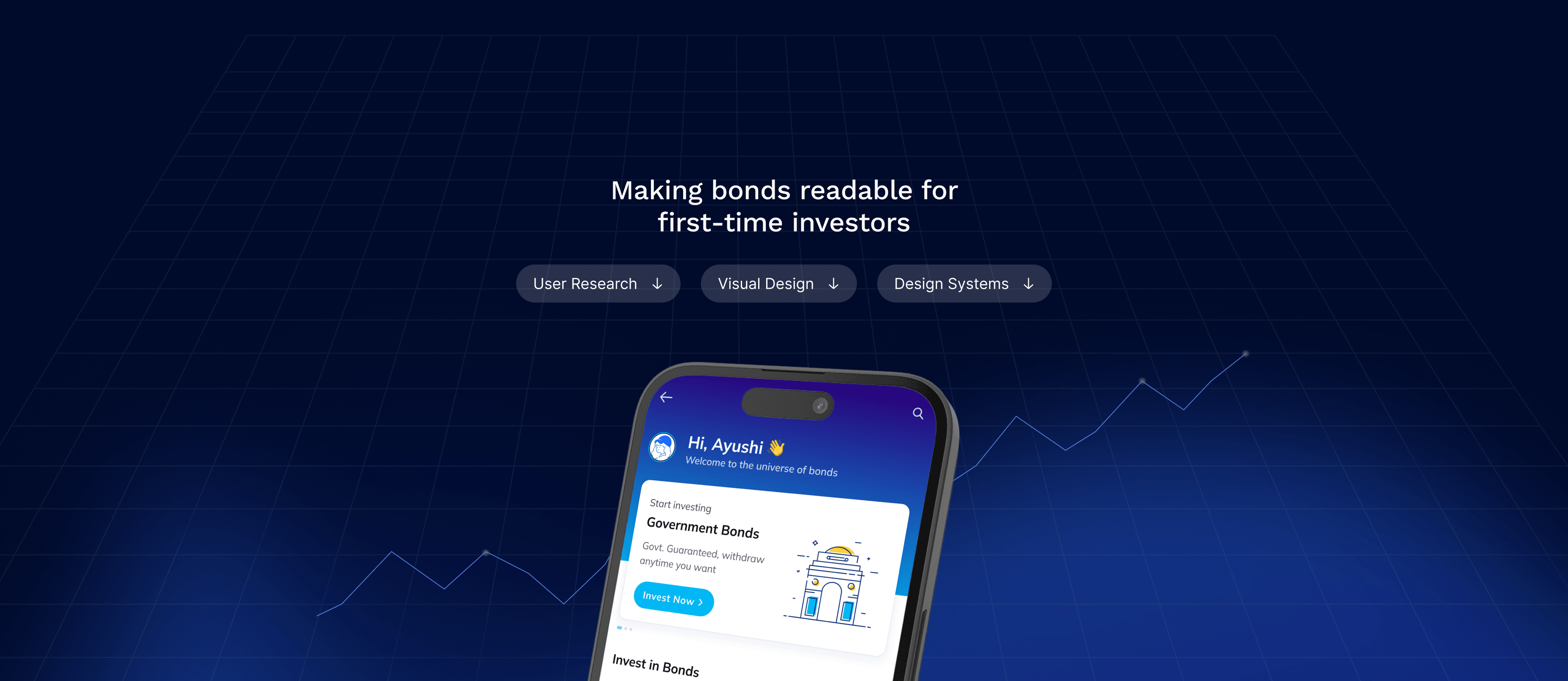
Making bonds readable for first-time investors
Role
Visual Designer
Team
2 Developers
1 Product manager
1 Bonds Expert
Timeline
Jan ’23 - May ’23
Stack
Figma,
Adobe Illustrator
Introduction
Paytm paytm.com is one of India’s largest payments ecosystems, with 333M+ registered users. Paytm Money
 paytmmoney.com is its investing arm. When I joined, the focus was on stocks and mutual funds, and bonds still belonged to institutions.
In 2023, SEBI, India’s market regulator, wrote new rules, and the minimum amount fell from ₹10 lakh to ₹1 lakh (roughly $12,000 to $1,200).
Suddenly a bond was something a retail investor could buy from an app, and Paytm Money wanted to be the place they bought it.
Where I came in
Most of my work at Paytm Money had been about visual and growth communications. I was the first visual designer on the Bonds app.
I shaped what a customer sees: the listing cards, the detail page, the order flow, and the icons and illustrations. I also led the Bonds launch campaign. Testing icons, banners, and push creatives told me what customers noticed and what they ignored.
My contributions
- Research: 12 user interviews (new & experienced users).
- Designing listing card, details screen, watchlist page.
- Custom icons and illustrations.
- UX patterns and interactions.
- Launch campaign and marketing creatives.
Learning bonds
I knew very little about bonds when I started, so I went to learn. I attended events, sat with the bonds expert and learned how bonds work and how they differ from mutual funds or stocks.
By the time I sat down with customers, I understood their questions well enough to ask better ones.
Learning from research
I wanted to know what a first-timer needed to see before they trusted a bond. With the product manager and bonds expert, I wrote a questionnaire for 12 customers to understand why and how they invest.
Then I interviewed those customers, and I asked three crucial questions:
What do you look at first?
What makes a listing feel safe?
What makes you walk away?
They said the same thing. Every listing threw everything at them at once, and nobody could tell which numbers decide whether a bond is worth buying.
What the customer told me
I plotted the answers on a matrix (below) by how much each piece of information drove the decision and how easily people understood it.
A clear order came out.
Company name first, because trust starts with “have I heard of them.” Then three numbers, in the order people asked for them: tenure, amount, and ask rate. Rating, coupon, and maturity mattered, but they confirmed a choice rather than made it.
I used the matrix to construct the listing card. Each exploration pushed one thing forward: rating, tenure, the buy action, the portfolio state. Feedback from the PM, the bonds expert, and my peers narrowed it to two cards.
Ask rate, not coupon.
Coupon is the rate printed on the bond. Ask rate is what you earn at today’s price. Across our inventory those two numbers diverged all the time.
A 0% Government of India bond shows 0% coupon but earns 4.5%. Coupon would have made whole categories unreadable.
Every customer I interviewed said coupon rate mattered, but as a second check. Ask rate was what they wanted first, so it became the main number on the card.
The rest of the flow
A customer starts on the home screen and reaches bonds from either the bonds banner or the All Products section. Below is the whole flow I designed, from the homepage to the Order Successful screen.
Every component on these screens, from the cards to the stepper to the illustrations, was built on the Paytm design system and extended by me for bonds.
First-timers couldn’t tell why to pick a government bond over a corporate one. Instead of one line, I gave each type its own banner with three benefits, an illustration, and a CTA.
Working on bonds details page
The detail page carries a lot of financial information. I split it into tabs by what people were asking: the bond itself, the company, the company’s financials, tax, and a beginner’s guide.
The “Keep in mind” card.
I designed a tip card that sits above Bond Details and names anything that changes the return. For example, some bonds pay a lower coupon when you buy more than one lakh. Customers would not find that in a table.
Watchlist page
In my user interviews, I found that users were screenshotting bonds to compare them later using different websites. I designed a save pattern and a watchlist page so they could compare inside the app.
Design system contribution
I built the Bonds screens on the Paytm design system and added what Bonds needed:
The card component with its states, custom icons, and the illustrations.
Colors came from the system’s six semantic colors. Type was Mulish for text and Lato for numbers. I worked alongside the design system team so the new components fit what they were building.
Working and collaborating
Every other day I sat with the product manager and the bonds expert. Those sessions were where the questionnaire got written, where the matrix got worked through, and where the tabs on the detail page got named.
Every week I met the engineers to learn what the app could and could not do, which patterns already existed, and how long a new control would take to build.
What design is, after Bonds
I used to think my job was to make things look simple. Bonds taught me what simple costs.
Twelve people told me what they look at first before they invest, and that shaped the Bonds product as it is today.
After launch, I led the campaign, testing creatives and tracking what brought customers from the homepage to the Bonds page. Click-through went from 5% to 12% in two months.